🔍 Options Are Pricing a Calm Nifty. The Last 63 Days Tell a Different Story.
The Distribution the Market Is Selling You
Every serious options trader/institutional firms/prop desk eventually confronts the same question: Is the probability distribution implied by current option prices actually realistic ?
Everyone analyze implied volatility, gamma, and skew constantly. But very few institutional take the extra step of comparing the full distribution that options are pricing today against what has actually occurred in recent history.
Powered by in-house design algorithms, the proprietary "Alpresi RTX tool" by ALPRESI RESEARCH delivers real-time insights into what is actually happening inside any market's implied options distribution
That’s what this chart does at Alpresi RTX :-
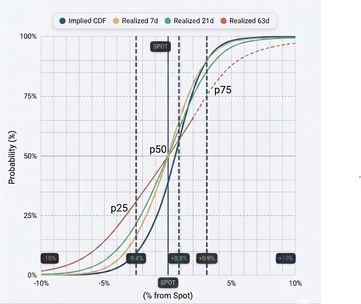
It compares the Cumulative Distribution Function (CDF) of Nifty spot returns:
- Blue → Distribution currently implied by option prices
- Yellow & Green → Actual realized distributions over the last 7 days and 21 days
- Red → Actual realized distribution over the last 63 days
The vertical lines mark the 25th, 50th, and 75th percentiles of the implied distribution.
What the Chart Reveals
The implied distribution (blue) tracks the short-term realized moves (7d and 21d) quite closely. This suggests that near-term option pricing is reasonably aligned with recent behavior.
However, when we compare it with the 63-day realized distribution (red), a clear gap emerges.
At the point above p75 somewhere on the chart:
- Implied CDF: 99.18%
- Realized 63d CDF: 93.55%
This means that over the past three months, larger moves occurred more frequently than what today’s options market is pricing in. The red line sits below the others on the positive side -clear evidence that the market is currently pricing a thinner right tail than what Nifty has actually delivered.
In simple terms: Options are pricing a calmer distribution than recent 63-day history suggests.
How to Read Implied vs Realized CDF for Option Pricing
Many traders struggle to translate CDF comparisons into actionable insights about whether puts or calls are expensive or cheap. Here’s the practical framework:
| Region | Condition | Meaning | Implication |
|---|---|---|---|
| Left side (Downside) | Implied CDF > Realized CDF | Market prices higher probability of large down moves | Puts are expensive |
| Left side | Implied CDF < Realized CDF | Market prices lower probability of large down moves | Puts are cheap |
| Right side (Upside) | Implied CDF < Realized CDF | Market prices higher probability of large up moves | Calls are expensive |
| Right side | Implied CDF > Realized CDF | Market prices lower probability of large up moves | Calls are cheap |
Applying this to the current chart:
At the highlighted say near to p75 positive point, we have Implied CDF > Realized 63d CDF. According to the table above, this means calls are relatively cheap compared to the last 63 days of realized moves.
On the downside near to p25, the 63-day realized line rises earlier than the implied line, suggesting puts are also relatively cheap on the left tail when benchmarked against recent history.
Why This Matters for Gamma Traders
This isn’t just theoretical. It directly affects how you should think about gamma and tail risk:
- If you are short gamma, you are implicitly betting that realized moves will stay closer to the thinner implied distribution. The last 63 days suggest this assumption carries more risk than the market is currently charging for.
- If you are long gamma or positioned for larger moves, current pricing may be offering a slight statistical edge- especially if you expect the volatility environment to remain closer to the recent 3-month regime.
- The divergence between short-term alignment and 63-day divergence also raises an important regime question: Is the market anticipating lower volatility ahead, or is it simply underpricing tail risk in the near term ?
The Practical Takeaway
Most traders look only at implied volatility. The more powerful approach is to regularly compare the entire distribution options are pricing against actual realized behavior.
When the implied distribution starts diverging from recent realized moves (especially in the tails), it usually signals one of two things:
- The market expects a regime shift, or
- There is a temporary mispricing of tail risk that can be exploited.
Right now, the data points toward the second possibility.
Final Thought
Options don’t just price volatility- they price an entire narrative about how much the market can move. The current narrative being told by Nifty options is one of relative calm and contained moves.
The last 63 days of actual price action are telling a noticeably different story.
The edge lies in deciding which version of reality you believe- and positioning gamma and tail exposure accordingly.
Disclaimer: The content of this post is purely educational and derived from standard textbooks. It does not constitute investment or trading advice, including the buying or selling of indices, in any financial market.